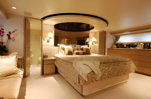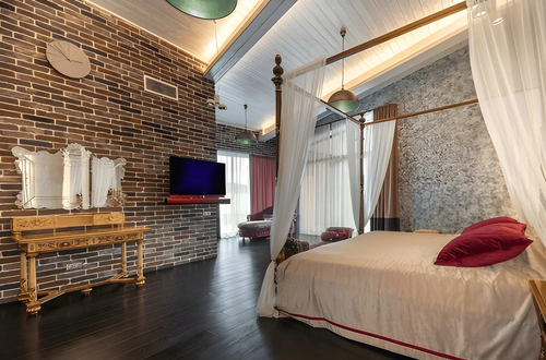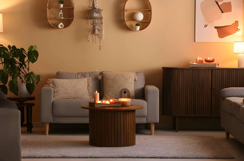
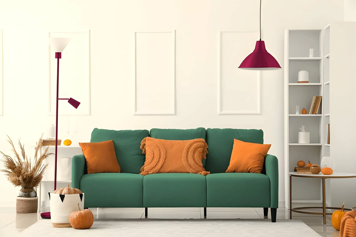
Two rooms can use the same grey sofa, the same oak table, and the same blue rug, and one feels polished while the other feels off. Nobody can point to a single mistake. The pieces are all decent, yet something in the pairing does not sit right. So why do some interior combinations look better than others?
The answer is that the eye judges relationships, not objects. It checks what two pieces share, how much they differ, and whether the visual weight feels balanced. When those checks pass, a mix looks deliberate. When they fail, even expensive items look random. This article turns those checks into a method you can use before you buy. You will find a quick answer, a shared-variable rule, an undertone guide, a visual weight table, a quick test you can run in any room, and the mistakes that sink good pieces. It suits apartments and large homes alike. Read the quick answer first, then use the sections you need.
Why Do Some Interior Combinations Look Better?
Some interior combinations look better because the pieces share at least one quality, such as undertone, finish, shape, or scale, while differing in another. Shared qualities make the eye read the room as one design. Controlled differences keep it interesting. Combinations fail when pieces share nothing or differ in everything.
The Shared-Variable Rule
Every pair of objects varies in several ways. Good interior combinations keep some variables the same and change others on purpose.
| Variable | Keep the same when… | Change it when… |
|---|---|---|
| Undertone | Always, if possible | Rarely |
| Finish (matte, gloss) | You want calm | You want contrast |
| Shape (curved, angular) | You want unity | You want energy |
| Scale | You want balance | One piece is the star |
| Era or style | You want cohesion | You want a collected feel |
Aim to share two variables and differ in one. A curved walnut chair beside an angular walnut table shares wood and undertone, and differs in shape. That is why it works.
Undertone: The Quiet Deciding Factor
Most clashes come from undertone, not color. Two whites or two woods can both be “neutral” and still fight.
| Undertone | Looks like | Pairs well with |
|---|---|---|
| Warm | Cream, honey oak, brass | Terracotta, olive, camel |
| Cool | Grey-white, ash, chrome | Navy, slate, silver |
| Neutral | Greige, mid-tone woods | Either, with care |
Hold samples next to each other in daylight and in evening light. If one looks yellow and the other looks blue, the pairing will feel wrong even if you cannot say why.
Visual Weight and Balance
Objects carry visual weight through size, darkness, and detail. Interior combinations feel balanced when weight is spread across a room, not piled on one side.
| Heavy | Light |
|---|---|
| Dark colors | Pale colors |
| Solid bases | Open legs |
| Strong pattern | Plain surfaces |
| Large scale | Slim profiles |
Pair a heavy sofa with a lighter, open-legged table, and the room breathes. Pair a heavy sofa with a heavy table and a dark rug, and it feels stuck to the floor. If you need pieces in a certain finish or shape, you can check out [anchor text] before you decide.
The Squint Test
Stand across the room and squint until the details blur. What remains is the real composition: patches of light, dark, and color. Ask three questions.
- Is there one dark area, or three random ones? Dark patches should repeat or have a clear reason.
- Is there a focal point? One area should stand out.
- Does color spread across the room? One color should show up at least twice.
If the blurred room looks messy, the details will not save it.
Why Familiarity and Surprise Both Matter
People tend to like what is easy to process, which is why repeated colors and shapes feel comfortable. Yet a room with no surprise looks dull. The best interior combinations mix both: mostly familiar, with one unexpected piece. That could be a bold lamp, an old chair, or a patterned cushion. If everything is unusual, the eye has no place to rest.
Mistakes That Make Combinations Look Wrong
The most common mistake is matching the color but ignoring undertone. Another is choosing pieces one at a time without testing them together. A third is making every item equally important, so nothing leads. Finally, mixing too many finishes, such as brass, chrome, black, and copper, can feel chaotic. Stay with two metals and one wood tone as a starting point.
FAQ
Can I mix wood tones?
Yes, if they share an undertone and you vary the shade slightly. Avoid two nearly identical woods that look like a mistake.
How many patterns are too many?
Three is usually the limit in one room, with different scales so they do not compete.
Do interior combinations need to match?
No. They need a link, such as color, material, or shape.
How can I test a combination before buying?
Use samples, photos, or fabric swatches in your own light and view them from across the room.
Bottom Line
Some interior combinations look better than others because they share a variable, match in undertone, and balance visual weight. Test with samples, run the squint test, and let one piece lead. Do that, and your choices will look planned instead of random.
For interior combination ideas must visit https://decoratoradvice.ca/