There’s a specific kind of design regret that US homeowners describe more consistently than almost any other. Not “I wish I hadn’t painted it that color” — the opposite. “I wish I’d been braver.” The greige that was chosen because it felt safe. The neutral sofa that matched everything and distinguished nothing. The living room that looks fine and feels forgettable because every decision prioritized not being wrong over being right.
Bold choices in a living room are statistically less regretted than safe ones. That’s not an opinion — it’s the consistent finding when homeowners reflect on spaces they’ve redesigned multiple times. The greige gets repainted. The inoffensive sectional gets replaced. The safe choice that was supposed to work for everyone ends up working for no one in particular, including the people who live there.
This article makes the honest case for going bold in your living room — not recklessly, not trend-chasing, but deliberately and with enough specific guidance that the bold choice you make is one you’ll still be satisfied with in five years. We’ll cover which bold choices carry genuine staying power, which ones date quickly, how to commit to a bold direction without overcommitting, and why the living room is the right room to take the design risk you’ve been deferring.
Why Safe Living Room Choices Consistently Disappoint
The logic of playing it safe in a living room seems sound: choose neutrals, stay within proven parameters, avoid anything that might look wrong or go out of style. The problem is that this logic produces rooms that look right to everyone and feel personal to no one — including the homeowner.
| Why Safe Choices Disappoint | What Happens Instead | What Bold Choices Produce |
|---|---|---|
| Neutral palette pleases no one specifically | Room feels generic, hotel-like | Clear aesthetic identity that feels personal |
| Safe furniture in safe colors | Nothing to respond to — room lacks a focal point | Anchor piece that gives the room a center of gravity |
| Trend-neutral choices | Often trend-aligned in a different direction than intended | Choices made from personal conviction last longer |
| Everything matches | Visual coherence without visual interest | Contrast and tension that make rooms memorable |
| Fear of commitment | Room stays unresolved indefinitely | Completed rooms with clear design intent |
Environmental psychologist Colin Ellard’s research on human responses to environments consistently found that bland, visually understimulating spaces produce lower mood and engagement than environments with visual interest and character. This isn’t the case for overwhelming or chaotic spaces — it’s specifically about the zone between bare functionality and genuine design engagement where most safe living rooms land.
The Bold Living Room Choices With the Best Staying Power
Deep Wall Color
This is the bold choice with the longest track record and the highest satisfaction rate among US homeowners who make it. Deep colors — navy, forest green, charcoal, burgundy, warm terracotta at its more saturated end — have been used in quality residential design for centuries. They’re not trend choices. They’re enduring choices that happen to be underused in contemporary US residential design because of a cultural overcorrection toward neutrals that’s been running for about fifteen years.
The specific colors with the most documented aesthetic longevity in living rooms:
| Bold Wall Color | Historical Precedent | Best Living Room Configuration | Risk Level |
|---|---|---|---|
| Deep navy | 200+ years in quality residential design | Good natural light, white or cream trim | Very Low |
| Forest green | Traditional libraries, contemporary Scandinavian | Any orientation — works in low and high light | Very Low |
| Warm charcoal | Arts and Crafts through contemporary | Large rooms — creates drama, not compression | Low |
| Burgundy / wine | Traditional dining and living, Art Deco | Social, entertainment-focused living rooms | Low-Medium |
| Warm terracotta (deep) | Mediterranean, Southwest, Contemporary | Warm-climate homes, specific palette commitment | Medium |
| Midnight teal | Victorian through contemporary | Smaller living rooms where intimacy is the goal | Low |
A Statement Sofa in a Non-Neutral Color
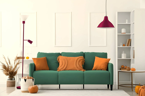
The most common living room regret among US homeowners who redesign twice: wishing they’d chosen a sofa in a color rather than another variation of grey or beige. A sofa in forest green, deep navy, warm rust, or dusty blush doesn’t limit future decorating flexibility as much as homeowners fear — and it provides the anchor element that neutral sofas consistently fail to.
The duration concern is real but overestimated. Sofa upholstery in quality fabric in a classic color — not a trend color, but a color with decades of residential precedent — doesn’t date the way a trending silhouette does. A deep green velvet sofa purchased in 2015 looks just as relevant in 2025 as it did then. A sofa in a specific trendy shape from the same year does not.
Patterned or Statement Rug
A large, visually significant rug is the bold choice with the lowest commitment risk — rugs are movable, replaceable, and transformable without the permanence of paint or the investment of upholstery. A geometric pattern in two strong colors, a Persian or Moroccan-influenced design, or an abstract rug in an unexpected palette can provide the visual anchor and the color story from which the entire living room builds.
The caution here is scale: a patterned rug in the wrong size is worse than no pattern. The rug must be large enough for the primary seating group to rest on it — too small and the pattern is isolated from the furniture and reads as random rather than anchoring.
How to Go Bold Without Going Wrong
The distinction between bold choices that work and bold choices that fail isn’t daring — it’s specificity and relationship. Bold choices that work are:
Historically grounded — they have precedent in quality residential design across multiple decades, not just in current trend media.
In relationship with each other — a deep green wall, a warm wood floor, and cream upholstery are in conversation. A deep green wall, a grey sofa, and a blue rug are competing.
Applied with restraint elsewhere — a bold wall color works when other elements provide the neutral balance. A bold sofa works when walls and rugs provide the restraint it needs to read as intentional rather than crowded.
| Bold Choice | What to Keep Neutral | What to Allow Bold |
|---|---|---|
| Deep wall color | Upholstery, large rug | Artwork, cushions, accent pieces |
| Statement sofa color | Wall color, floor treatment | Cushions, throws, small accessories |
| Patterned statement rug | Wall color, large upholstery | Accent pillows that pull from rug palette |
| Statement light fixture | Everything else — let it be the solo bold | Artwork that acknowledges the fixture’s scale |
| Bold artwork | Everything — the art is the room’s statement | Cushions that carry one color from the artwork |
The Bold Choices That Date Quickly — And Aren’t Worth the Risk
Not all bold choices carry the same staying power. Some that look distinctive now are specific to the current aesthetic moment in a way that will be clearly visible in five years.
| Bold Choice | Why It Dates | What to Do Instead |
|---|---|---|
| Trendy furniture silhouette (current “it” shape) | Silhouette was the trend, not the color | Choose classic proportion in a bold color |
| Matching bold color throughout (tone-on-tone extreme) | Peaks quickly when the color moves out of media favor | Bold color on one dominant surface, not all surfaces |
| Currently trending specific color (Pantone of the year) | Identifies the room as from a specific year | Choose colors with 20+ year residential precedent |
| Maximalist layering without editing | Looks bold initially, becomes visual noise | Bold within restraint — one or two anchors, not everything |
| Novelty materials (unusual finishes at trend peak) | Material becomes associated with the trend period | Quality natural materials in bold applications |
Frequently Asked Questions
What is the most common bold living room choice US homeowners regret?
Not making one. When homeowners who’ve redesigned a living room are surveyed retrospectively, regret about going too bold is significantly less common than regret about playing too safe. The greige that felt responsible ends up being the choice most often repainted within three years. The deep green that felt risky tends to stay.
How do I go bold in my living room without the room feeling overwhelming?
Apply the bold choice to one dominant surface — typically the wall behind the primary seating — and keep the remaining major elements in the room neutral or low-contrast. A deep navy wall with cream upholstery, natural wood floors, and white trim reads as bold and composed simultaneously. The same navy on all four walls with dark furniture and a patterned rug reads as overwhelming.
Is bold always about color or can it be other design elements?
Bold applies to scale, texture, pattern, and material as much as to color. An oversized piece of artwork that fills a significant portion of a wall is a bold choice that doesn’t involve color commitment. A sofa in an unexpected texture — velvet in a neutral color, or bouclé in a warm white — is a bold material choice that works in spaces where color boldness doesn’t suit the architecture. Scale boldness — choosing furniture significantly larger than the default — is often the most underused bold choice.
How do I know if a bold choice will last or date quickly?
Ask how long the color, form, or material has appeared in quality residential design independent of current trend coverage. Deep navy has been in living rooms for over a century. A specific trending shade of sage that’s been prominent in design media for eighteen months has not. The former is a bold choice with staying power. The latter is a trend dressed as a bold choice.
What’s the lowest-risk way to try boldness in a living room?
Artwork first. A single large, bold piece of artwork — strong color, significant scale — costs less than a sofa or paint job, can be moved or replaced, and provides the experience of how the living room feels with a visual anchor before committing to anything more permanent. If the room improves dramatically with the artwork (which it usually does), that’s the signal to build the rest of the room around it.
The Bottom Line
The living room most US homeowners are actually proud of — the one they photograph, show guests, return to willingly — is rarely the one that was designed to offend no one. It’s the one where someone made a decision with enough conviction that the room has a character it couldn’t have achieved through caution.
Bold in a living room doesn’t mean loud, maximalist, or trend-chasing. It means choosing with enough specificity that the room reflects someone’s actual taste rather than a generalized idea of what a nice room looks like. Deep wall color with historical precedent. A sofa in a color rather than another shade of grey. Artwork at a scale that actually fills the wall. A rug with pattern significant enough to anchor the furniture above it.
These are achievable. They carry less risk than the safe choice that gets repainted in three years. And they produce the living room you’ll actually want to live in.
Must visit https://decoratoradvice.ca/ for living room ideas.