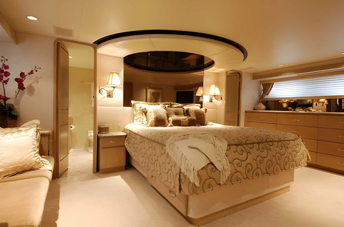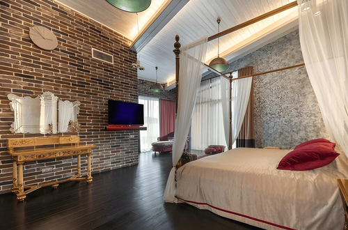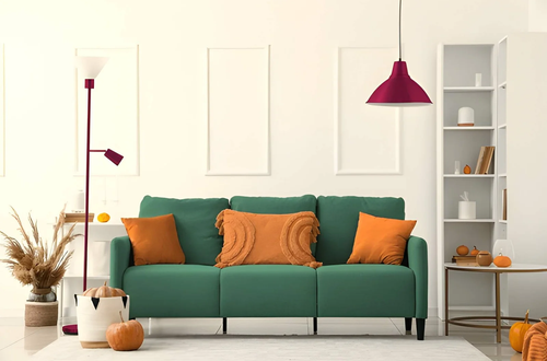

There’s a quality that professionally designed rooms have that most homeowners struggle to identify and therefore struggle to replicate. The room looks right in a way that goes beyond individual piece selection — every element seems to belong, the proportions feel resolved, and the space produces an emotional response that individually good furniture in an amateur arrangement rarely achieves. That quality isn’t luck, taste, or budget. It’s the deliberate application of specific visual effects techniques that professional designers use consistently and that most homeowners have never been formally taught.
The gap between a room that looks designed and one that looks furnished is almost always a gap in visual effects knowledge — not a gap in resources. Design professionals earn their fees not primarily by selecting better objects but by understanding how objects relate to each other spatially, tonally, and in scale, and then arranging those relationships to produce specific perceptual outcomes.
This article names those techniques explicitly. Not as principles to interpret but as specific visual effects to apply — the contrast techniques, the scale relationships, the layering approaches, and the spatial decisions that professional designers reach for consistently because they reliably produce the results clients are paying for.
What Professional Visual Effects Actually Are
Before covering specific techniques, it helps to understand what “visual effects” means in a design context. These aren’t decorative tricks or optical illusions — they’re deliberate manipulations of how the brain processes the spatial, tonal, and material information in a room.
The brain interprets rooms through several processing systems simultaneously: scale relationships (does this object belong in this space?), contrast patterns (where should I look first?), depth perception (how large is this space?), and emotional response (how does this space make me feel?). Professional designers manipulate all of these simultaneously through specific techniques that produce predictable perceptual outcomes.
| Visual Effect Category | What It Manipulates | Perceptual Outcome |
|---|---|---|
| Contrast and hierarchy | Where the eye goes first | Creates focal points, visual order |
| Scale relationships | How the brain assesses proportion | Rooms feel balanced or unbalanced |
| Depth creation | How the brain perceives spatial volume | Rooms feel larger or smaller |
| Texture layering | Tactile and visual richness | Rooms feel warm or cold |
| Color temperature harmony | Tonal coherence across elements | Rooms feel resolved or fragmented |
| Light modeling | How forms and materials appear | Objects look three-dimensional or flat |
| Rhythm and repetition | Visual flow and continuity | Rooms feel designed or assembled |
The Specific Visual Effects Techniques Professional Designers Use
Contrast Hierarchy: Creating a Visual Entry Point
Every well-designed room has a deliberate contrast hierarchy — a sequence of visual contrast that tells the eye where to go first, second, and third. Without this hierarchy, every element competes for attention simultaneously, which produces the visual noise that makes rooms feel cluttered even when they’re not crowded.
Professional designers establish hierarchy by making one element the room’s strongest contrast against its surroundings (the focal point), supporting elements at lower contrast levels, and background elements that recede. The eye enters the room, goes to the highest contrast element first, then follows a descending sequence of contrast through the space.
In practice: a dark sofa against a light wall creates strong contrast that establishes the primary focal point. Artwork above the sofa at medium contrast creates the secondary point. Accessories in tonal values similar to the wall create the tertiary layer. The sequence is controlled — not accidental.
| Contrast Level | Element Role | Example |
|---|---|---|
| High contrast (primary) | Focal point — eye goes here first | Dark sofa on light wall, bold artwork |
| Medium contrast (secondary) | Supporting element — eye goes here second | Accent chairs in mid-tone, decorative lamp |
| Low contrast (tertiary) | Background — eye goes here last | Accessories near wall color, blended rug |
| No contrast (background) | Recedes completely | Walls, ceiling, neutral floor |
The 60-30-10 Color Rule Applied Precisely
Every design publication mentions the 60-30-10 rule. Very few explain why it produces the visual effects it does or how to apply it with the precision that makes it work.
The rule works because it replicates the contrast hierarchy above using color distribution: 60% (dominant, usually walls and large furniture) establishes the room’s color temperature. 30% (secondary, usually upholstery and curtains) creates the relationship the eye reads as the room’s palette. 10% (accent, usually accessories and art) provides the contrast punctuation that makes the palette feel resolved rather than two-dimensional.
The precision matters: when secondary or accent proportions drift toward each other — when the room has three colors in equal measure — the hierarchy collapses and the room loses its visual clarity. Professional designers maintain the proportion discipline because the visual effects depend on the ratio, not just the color selection.
Scale Contrast for Visual Interest
Rooms that feel flat — professionally furnished but somehow inert — almost always have insufficient scale contrast. Every piece is medium-sized, which creates a uniformity that registers as boring rather than harmonious.
Professional designers deliberately mix scale — a very large element alongside small ones, a massive artwork beside delicate accessories — because the contrast between scales creates visual interest that same-scale arrangements can’t achieve. The eye is stimulated by the relationship between a 6-foot floor lamp and a 4-inch candle holder; it’s not stimulated by five medium-height elements in a row.
| Scale Contrast Pairing | Visual Effect | Where to Apply |
|---|---|---|
| Large artwork + small accessories | Drama, intentional presence | Primary wall, above sofa |
| Tall floor lamp + low coffee table | Height variation, visual movement | Living room corners |
| Large rug + small accent stool | Ground and float relationship | Seating groups |
| Oversized mirror + delicate objects | Reflection amplifies, objects punctuate | Hallways, dining rooms |
| Substantial sofa + slender side table | Weight and lightness tension | Any seating area |
Texture Layering for Visual Depth
Rooms that photograph beautifully but feel flat in person have usually achieved tonal harmony (the colors work) without achieving textural variety (the surfaces all behave similarly). Texture layering is one of the most consistently used visual effects in professional design because it adds visual depth that color alone can’t produce.
The layering principle: each major surface in a room should have a different material behavior. Smooth surfaces (glass, painted wood, polished metal) reflect light. Matte surfaces (linen, matte paint, rough stone) absorb it. Textured surfaces (knit, brick, woven fabric) scatter it. A room with all smooth surfaces is visually flat. A room that moves between smooth, matte, and textured reads as rich and three-dimensional.
Professional designers typically establish a rough texture baseline (rugs, throws, cushions), add mid-texture elements (upholstery, curtains, unfinished wood), and contrast with one or two smooth or reflective surfaces (glass, polished metal, lacquer). The resulting texture gradient produces the layered, warm quality that most homeowners are trying to achieve with color — which is the wrong variable.
The Rule of Odds in Object Grouping
Object arrangements in professionally designed rooms are almost never in pairs or even numbers. This is a deliberate visual effects choice based on how the brain processes groupings: odd-number groupings (three, five, seven objects) feel natural and organic. Even-number groupings feel deliberate and symmetrical — which reads as formal and static rather than designed.
The three-object grouping rule: objects grouped in threes should vary in height, width, and depth simultaneously. A tall narrow vase, a short wide bowl, and a medium rounded object create three-dimensional visual interest. Three objects of similar scale in a row are an even distribution rather than a composition.
Visual Effects That Apply Across Every Room
| Visual Effect | Technique | Application |
|---|---|---|
| Expand perceived space | Long horizontal element at eye level | Floating shelf across an entire wall |
| Create intimacy | Pool of light rather than even overhead | Floor lamp in corner, dimmed overhead |
| Add perceived height | Vertical element from floor toward ceiling | Full-height curtains, tall bookcase |
| Anchor floating elements | Connecting element through color or material | Rug that shares a color with artwork above |
| Create visual rest | Empty space adjacent to busy area | Clear surface beside object grouping |
| Produce luxury feel | Material quality visible at close range | Textured fabrics, natural stone, solid wood |
| Establish cohesion | Repeated element throughout the room | Same metal finish in lighting, hardware, accessories |
Frequently Asked Questions
What’s the most impactful visual effect technique for an average US living room?
Contrast hierarchy — establishing one clear focal point that the rest of the room supports rather than competes with. Most US living rooms have multiple elements competing for primary visual attention simultaneously, which produces visual noise without visual interest. Establishing one clear primary element (a significant piece of artwork, a bold sofa, a statement light fixture) and ensuring everything else supports rather than competes with it produces the “designed” quality most homeowners are seeking.
Why do professionally designed rooms look so different even with similar furniture?
Because professional designers manipulate the relationships between elements rather than simply selecting good individual pieces. The same sofa, the same coffee table, and the same rug look entirely different depending on how they’re proportionally related, what contrast they create with the wall and floor, how texture is layered across them, and what visual hierarchy is established. The individual pieces contribute much less to the outcome than the relationships between them.
How do designers make rooms feel warm without changing the color scheme?
Through texture layering rather than color adjustment. Warmth in a room comes primarily from the presence of materials that absorb rather than reflect light — linen, wool, matte wood, rough stone — and from light sources at human scale (lamps rather than overhead fixtures) that create warm pools rather than even coverage. A room in cool grey tones with these textural and lighting qualities feels warmer than the same room in “warm” colors with flat lighting and smooth surfaces.
What’s the easiest visual effect technique for US homeowners to apply immediately?
The rule of odds in object arrangement. Look at your current decorative groupings and count the objects. Any group of two, four, or six can be improved by adding or removing one object to create an odd number, then varying the heights and widths of the remaining items to create the kind of three-dimensional grouping that designers use on every styled surface.
How do designers create the layered quality that makes rooms feel rich?
Through texture layering that ensures every major surface behaves differently — some smooth, some matte, some textured. Linen cushions on a leather sofa. A jute rug under a glass coffee table. Matte wall paint with polished metal fixtures. Each pairing creates the material contrast that produces visual depth. When all surfaces in a room reflect light similarly, the room reads as flat regardless of how much is in it.
The Bottom Line
The visual effects that make professionally designed rooms look extraordinary are specific, teachable techniques — not the product of extraordinary taste or unlimited budget. Contrast hierarchy tells the eye where to go. The 60-30-10 rule maintains color proportion discipline. Scale contrast creates interest. Texture layering produces depth. The rule of odds creates natural-feeling compositions.
Each of these is applicable immediately to any room in any US home, without purchasing anything new. The furniture you have, positioned and combined according to these visual effects principles, will read differently — because the relationships between elements will finally be doing the work that the individual pieces alone cannot.
Must visit https://decoratoradvice.ca/ for stunning visual effects.