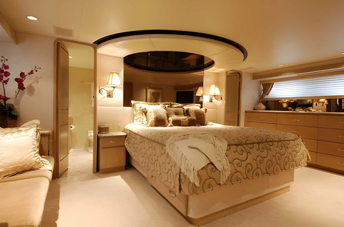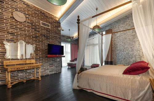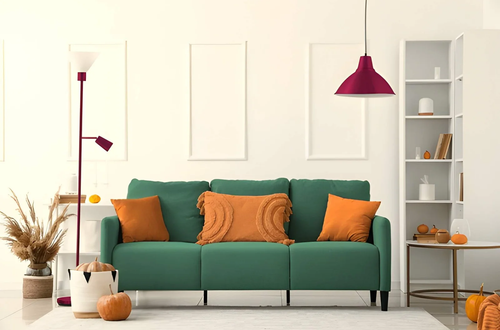
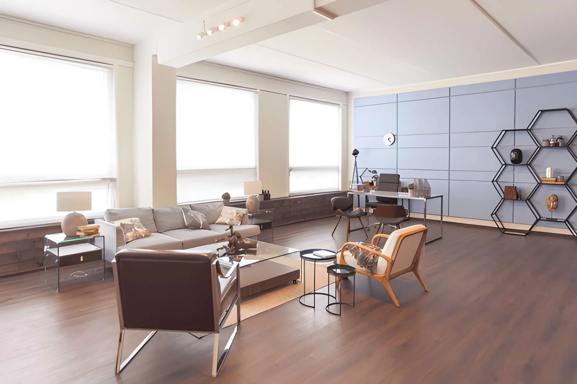
Spend ten minutes on any interior design platform and you’ll encounter rooms that stop you mid-scroll. They’re not just attractive — they have a quality of completeness, a sense that every decision was made deliberately and nothing was left to chance. These are picture-perfect interiors, and the reason they look the way they do has almost nothing to do with the budget that produced them.
Most US homeowners assume the gap between what they have and what they see in those images is financial. The furniture is more expensive. The space was professionally designed. Everything was custom-made or sourced from places they don’t have access to. Some of that is true. Most of it isn’t.
The actual gap is knowledge — specifically, knowledge of the specific decisions and techniques that produce picture-perfect interiors at the point where photography captures them. These decisions are learnable, most are free to apply, and many of them contradict what feels intuitive when arranging a room without training. This article covers the most significant ones: the secrets that explain why those rooms look the way they do, and how US homeowners can apply them without professional help or professional budgets.
Why Picture-Perfect Interiors Look Different From Everything Else
The quality that distinguishes picture-perfect interiors from simply furnished ones isn’t any single element — it’s the presence of a resolved relationship between all elements. Nothing is competing for attention that shouldn’t be. Nothing is missing that should be there. The room reads as complete in a way that assembled spaces don’t, even when the assembled spaces have individually better pieces.
| Quality | Picture-Perfect Interiors | Standard Furnished Rooms |
|---|---|---|
| Visual hierarchy | Clear — eye knows where to go | Absent — everything competes |
| Proportion | Every piece correctly scaled for space | Mix of appropriate and inappropriate scales |
| Negative space | Used deliberately — breathing room visible | Filled — no visual rest |
| Material cohesion | Materials relate to each other | Materials coexist without relationship |
| Light quality | Layered, warm, dimensional | Flat, single-source, overhead |
| Personal specificity | Objects that carry meaning or character | Generic purchases without specificity |
| Edit quality | Nothing present without reason | Items present through inertia or habit |
The Secrets That Produce Picture-Perfect Interiors
Secret 1: Styling for the Camera vs. Styling for Daily Life
This is the secret most homeowners don’t realize exists: picture-perfect interiors in photographs are frequently styled differently from how they’re lived in. Decorators and design photographers add, remove, and reposition objects specifically for photography — a process called “styling” that produces the ideal version of a room at a specific moment.
What this means practically: the arrangement of objects in a styled photograph is aspirational rather than functional. Books are stacked rather than shelved alphabetically. Flowers are fresh. Surfaces that are usually occupied with daily-use items are cleared. Cushions are karate-chopped into precise angles. The room has been edited to its best possible version for a single captured moment.
Understanding this removes the frustration of comparing a lived-in room to a styled photograph. The more useful lesson: some styling principles that appear exaggerated in photography translate directly to room improvement — specifically the editing (clearing surfaces), the flower addition (any living element), and the cushion arrangement (deliberate rather than wherever they land).
Secret 2: The Edited Bookshelf Formula
Bookshelves in picture-perfect interiors follow a specific arrangement formula that almost no one applies naturally. Standard bookshelves are filled with books, densely, with spines outward, arranged by whatever order made sense at the time. The shelves in designed rooms look fundamentally different because they’re arranged using a formula rather than packed using available space.
The formula: books and objects in alternating groups of three to five. Within each group, books can face spine-out, but between groups, objects (a plant, a sculpture, a candle, a stack of books laid horizontally) create visual breaks. The shelf is never filled more than 70% — empty space is treated as a deliberate element, not wasted capacity.
| Bookshelf Element | Standard Approach | Picture-Perfect Interiors Approach |
|---|---|---|
| Book arrangement | Fill all space, spines outward | Groups of 3–5 with objects between |
| Capacity | 90–100% filled | 60–70% filled |
| Object inclusion | Minimal or none | Objects every 3–5 books |
| Color consideration | Whatever books are there | Some selection by spine color for visual flow |
| Empty space | Seen as waste | Treated as design element |
| Horizontal books | Rarely used | Stack of 2–3 books as resting point for objects |
Secret 3: The Diagonal Trick for Bedding
Beds in picture-perfect interiors almost universally have a specific bedding arrangement that most US homeowners never replicate. The duvet or comforter is pulled down or folded in a way that reveals layering beneath it: the flat sheet folded over the duvet top, pillows arranged in a specific order (euro shams at back, standard pillows in front, accent pillows at foreground), and often a throw folded or draped diagonally.
The diagonal element is what distinguishes styled beds from simply made ones. A throw placed at an angle across the bed’s corner creates visual movement and communicates that the bed was arranged deliberately rather than simply straightened. It’s a detail that appears in almost every photographed bedroom and that costs nothing to replicate.
Secret 4: The Fresh Element That Changes Everything
Picture-perfect interiors almost always contain one fresh element — flowers, a living plant, fresh fruit in a bowl, herbs in a jar. This isn’t sentiment or decoration for its own sake; it’s the addition of organic life and scale variation that manufactured objects can’t replicate.
A single bunch of grocery store flowers in a simple vase does more to make a room read as currently inhabited and carefully considered than any decorative object at the same price point. The freshness communicates timing — someone was in this room recently and added this — which produces the lived-in quality that styled rooms need to avoid looking like showrooms.
The specific placement: eye level in the room, on the surface most visible from the entry point. Not tucked in a corner where it adds to the inventory without contributing to the first impression.
Secret 5: The Third Dimension of Object Arrangement
Objects in picture-perfect interiors are arranged in three dimensions rather than lined up in a single plane. Most homeowners place objects on a surface in a row — everything at the same distance from the wall, everything visible from directly in front. Designed arrangements create depth by placing objects at different distances from the viewer, which creates layers that read differently from different positions in the room.
The depth arrangement: one object close to the front of the surface, one at middle depth, one at the back — each at a different height and with different visual weight. The eye travels through the arrangement rather than across it, which creates the visual richness that flat arrangements don’t achieve.
The Editing Secret That Underlies All Picture-Perfect Interiors
Every other secret in this article becomes more effective when the room has been properly edited — when objects present through inertia, habit, or the inability to decide what to do with them have been removed.
The consistent quality of picture-perfect interiors is not abundance — it’s curation. Every object earns its place by contributing to the room’s visual or functional story. Objects present because they’ve always been there, because they were gifts that couldn’t be declined, or because the alternative was finding somewhere else to put them are absent.
The editing test: for every non-functional object in a room, ask whether it contributes to the room’s aesthetic or tells something about the people who live there. Objects that fail both tests are clutter, regardless of their individual attractiveness or cost.
| Object Category | Keep | Remove |
|---|---|---|
| Personal provenance | Items with specific personal meaning | Items kept out of obligation |
| Aesthetic contribution | Objects that enhance the room’s visual story | Objects that compete without contributing |
| Scale appropriate | Objects correctly proportioned for their position | Objects too small to register or too large to sit easily |
| Functional daily use | Items used regularly enough to justify presence | Items rarely used and without aesthetic justification |
| Grouped relationship | Objects that relate to adjacent pieces | Isolated objects with no visual connection to surroundings |
Frequently Asked Questions
What makes picture-perfect interiors look so different from normally furnished rooms?
The presence of resolved relationships between elements rather than individually good elements placed without regard for each other. Picture-perfect interiors have a visual hierarchy (clear focal point), appropriate scale throughout, edited surfaces with breathing room, layered materials, and warm dimensional lighting. The individual pieces are less important than these relationships — which is why some rooms with expensive furniture still don’t read as designed, while some with modest furniture do.
Can US homeowners create picture-perfect interiors without professional help?
Yes — most of the techniques that produce picture-perfect interiors are free to apply. Editing surfaces (costs nothing), adding fresh flowers ($5 to $15), rearranging objects in three dimensions (costs nothing), and making a bed with a diagonally placed throw (cost of the throw) produce immediate visible improvement without professional involvement or new purchases.
Why do rooms always look better in photographs than they do in person?
Because photographs are styled for a single viewpoint at optimal lighting conditions, with professional editing and pre-photography preparation that includes clearing, adding, and rearranging specifically for the camera. The gap isn’t that the room is worse in person — it’s that the photograph represents its best possible moment. The more useful direction: what’s in those photographs that can be maintained rather than just staged?
What’s the most important edit to make before attempting to style a room?
Clear every flat surface completely, then add back only what earns its place. The surface-clearing reveals the room as it would look in a picture-perfect interiors photograph before styling — and also reveals which surfaces have been carrying objects that no longer serve the room. Starting from empty and adding back selectively is always more effective than rearranging what’s already there.
How do designers make shelves look so good in picture-perfect interiors?
Through the bookshelf formula described above — filling to 70%, alternating books with objects, creating visual breaks every three to five books, using some horizontal book stacks as object pedestals, and treating empty shelf space as a designed element rather than wasted capacity. The result looks curated rather than packed, which is the quality that distinguishes designed shelves from functional ones.
The Bottom Line
Picture-perfect interiors are the result of specific, learnable decisions applied consistently — not the product of extraordinary budget or exclusive access. The editing that removes what doesn’t earn its place. The bookshelf formula that creates curated display rather than packed storage. The fresh element that communicates current habitation. The diagonal throw that communicates deliberate arrangement. The three-dimensional object grouping that creates visual depth.
Each of these can be applied today, in your current home, with what you already have. The gap between your rooms and the ones that stop you mid-scroll is smaller than it appears — and it’s closable with knowledge rather than money.
For picture-perfect interiors must visit https://decoratoradvice.ca/