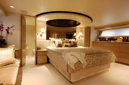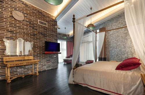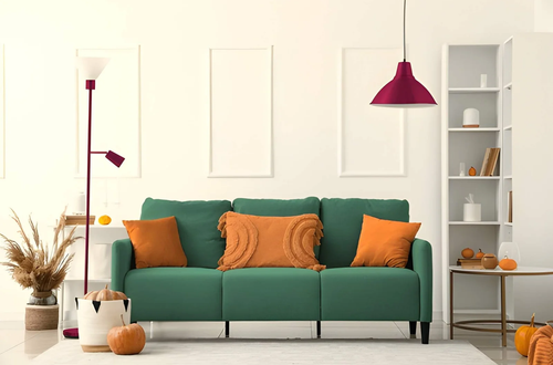
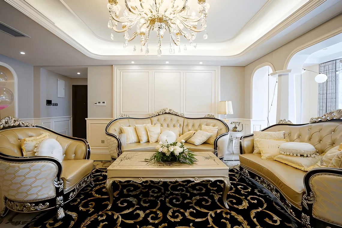
Some interiors read as expensive the moment you see them — not because you can identify specific pieces and price them, but because the overall effect registers as considered, refined, and beyond the reach of random purchasing decisions. Other interiors have individually more expensive pieces and still feel less elevated. The relationship between actual expenditure and perceived sophistication is weaker than most homeowners assume — and the gap between them is consistently explained by a set of specific decisions that have almost nothing to do with budget.
Understanding what makes an interior look sophisticated and expensive matters precisely because it uncouples the outcome from the investment. A well-executed interior in modest materials at careful scale will consistently read as more refined than an expensive interior where the underlying design logic is absent. Designers know this. They’re paid not to select expensive things but to make specific decisions about proportion, restraint, material coherence, and light that produce the sophisticated reading regardless of what the individual elements cost.
This article identifies those decisions precisely — the specific qualities that make an interior read as expensive to everyone who enters it, and the specific mistakes that undermine that reading regardless of how much was spent.
What “Expensive-Looking” Actually Means Perceptually
The brain doesn’t calculate expense — it reads a set of perceptual cues and generates a quality assessment based on those cues. An interior that reads as expensive is one that’s providing the right cues: restraint, material coherence, precise scale, and the absence of visual noise. An interior that reads as cheap is one that’s missing these cues regardless of what individual items cost.
| Perceptual Cue | Expensive-Looking Interior | Cheap-Looking Interior |
|---|---|---|
| Visual restraint | Breathing room — not everything occupied | Every surface filled — abundance signals insecurity |
| Material consistency | 2–3 materials relate throughout | Multiple materials compete without logic |
| Scale precision | Every piece correctly proportioned to its space | Mix of appropriate and inappropriate scales |
| Lighting quality | Warm, layered, dimensional | Flat, cool, single-source overhead |
| Edge and detail quality | Clean transitions, finished edges | Unresolved transitions, visible hardware |
| Color discipline | Controlled palette with clear hierarchy | Multiple competing colors without hierarchy |
| Negative space | Empty space treated as designed | Empty space treated as unfilled |
The Specific Qualities That Make an Interior Look Sophisticated
Restraint: The Most Misunderstood Luxury Signal
The single most consistent quality of expensive-looking interiors is restraint — fewer objects, fewer colors, fewer competing patterns — which the brain consistently interprets as confidence and intentionality. An interior that shows everything it has reads as insecure. An interior that holds back reads as selective.
This is why the most expensive-looking interiors are almost never the most fully furnished. They have significant empty space. Surfaces that aren’t fully occupied. Rooms where the negative space between objects is as considered as the objects themselves. Restraint signals that the person curating the space had choices and made them — which is the fundamental luxury signal.
The specific application: US homeowners trying to make their interior look more expensive should remove before adding. The interior that looks best after editing — after the objects present through habit and inertia are removed — is almost always more sophisticated than the same space before editing, regardless of what remains.
Material Coherence: The Quality That Creates Unity
An interior that reads as expensive almost always has a coherent material language — a small number of materials that relate to each other throughout the space. Natural oak and linen and matte white. Marble and brass and warm plaster. Concrete and walnut and aged steel. These combinations work because they establish a material vocabulary that the brain recognizes as a system — which reads as designed rather than accumulated.
Interiors that read as cheap often contain many materials that simply coexist without relationship: chrome next to brass next to matte black, pine next to oak next to walnut, glossy surfaces next to matte surfaces next to textured surfaces without any logic connecting the transitions.
The fix is reduction rather than replacement: identify the two or three materials already present that relate best, and remove or replace what doesn’t belong to that material family. The existing materials in many US homes are adequate; their simultaneous presence without editing is what undermines the interior’s reading.
| Material Combination | Quality It Reads As | Interior Style Context |
|---|---|---|
| Oak + linen + matte white | Warm contemporary, refined casual | Scandinavian, transitional |
| Marble + brass + warm plaster | Luxury residential, European influence | Contemporary classic |
| Concrete + walnut + aged steel | High-end industrial, sophisticated urban | Modern, loft, contemporary |
| Natural stone + white oak + linen | Resort-like, serene, elevated | Contemporary, coastal luxury |
| Dark stained wood + velvet + matte black | Rich, layered, sophisticated | Dark contemporary, moody |
| Terracotta + natural fiber + whitewash | Artisan, handmade, globally aware | Mediterranean, bohemian elevated |
Scale Precision: The Variable Nobody Talks About
Nothing undermines an interior’s sophisticated reading faster than scale problems — furniture that’s too small for the room it’s in, artwork that’s lost against a large wall, a light fixture that has no visual presence at the scale the room requires. The brain interprets correct scale as rightness — a kind of effortless belonging that incorrect scale never achieves regardless of the quality of the object itself.
This is why an expensive piece of furniture in the wrong scale reads as worse than a modest piece in the right scale. The modestly priced piece that fits perfectly contributes to the interior’s sophisticated reading. The expensive piece that’s slightly too small or too large introduces a visual wrongness that the brain registers as a mistake, regardless of what was paid for it.
The scale discipline that professional designers maintain: every significant piece is assessed for its proportional relationship to the surfaces it’s against, the ceiling above it, the floor below it, and the pieces around it — not for how it looks in the store or on a product page.
Lighting Quality: The Variable That Elevates Everything Else
The same interior photographed under flat overhead fluorescent lighting and warm layered lamplight looks like two different quality levels of space. The furniture, materials, and objects are identical. The perceived quality of the interior is not. Lighting is the variable that makes everything else look as good as it’s capable of looking — or prevents it.
Sophisticated interiors almost universally have warm light (2700K to 3000K), multiple sources at different heights, and dimming capability that allows the space to modulate its atmosphere. They don’t rely on a single overhead source doing all the illumination work. The light creates the conditions under which everything else is perceived.
| Lighting Condition | Interior Quality Perception | What It Does to Materials |
|---|---|---|
| Flat cool overhead only | Institutional, generic, cheap | Flattens texture, misrepresents warm tones |
| Warm layered sources | Sophisticated, residential, elevated | Reveals texture, enriches warm materials |
| Warm + directional (accent) | Very sophisticated, gallery-quality | Creates shadow that gives objects dimension |
| Dimmed evening setting | Luxurious, atmospheric | Every material reads richer at reduced intensity |
The Finishing Details: Where Sophisticated Interiors Win
The difference between an interior that reads as expensive and one that reads as almost there is often in the finishing details — the elements that aren’t the room’s primary features but that collectively determine whether the space feels fully resolved.
Curtains hung at ceiling height rather than at the window frame make any room read as more considered. The additional fabric extends the wall to ceiling height and makes windows appear larger and the room taller.
Hardware consistency. Brass cabinet pulls in the kitchen while chrome appears on the bathroom fixtures and matte black appears on the door handles — this inconsistency signals that no one considered the space as a whole. One finish throughout (or a deliberately complementary pair) reads as designed.
Art hung at correct height. Gallery standard is 57 to 60 inches to the center of the artwork. Art hung too high — the most common mistake in US residential spaces — disconnects from the furniture below and reads as an afterthought.
Clean transitions. Where flooring materials change, where walls meet ceiling, where built-in elements meet adjacent surfaces — these transitions either read as deliberate (designed) or accidental (cheap). Quality transitions use appropriate transition strips, consistent reveals, or deliberate material choices at the junction.
Frequently Asked Questions
What makes an interior look expensive without spending a lot of money?
Restraint and material coherence are the two qualities most accessible at low cost. Removing objects that don’t belong to the room’s visual vocabulary costs nothing. Ensuring that the materials already present relate to each other — by removing or recovering pieces that introduce conflicting materials — costs very little. Both changes produce a more sophisticated interior immediately because they address the underlying design logic rather than the surface appearance.
Why do some expensive interiors still look cheap?
Because the expensive purchases were made without the design logic that makes spaces read as sophisticated. Expensive furniture in incorrect scale, multiple high-quality materials without coherent relationship, layered lighting replaced by a single premium fixture — none of these produce the sophisticated reading that design logic produces. Budget pays for quality; design logic produces sophistication. They’re independent variables.
What’s the most common mistake that makes US interiors look less expensive than they are?
Art hung too high. It’s the single most widespread finishing detail error in US residential interiors — artwork positioned at eye level for a standing person rather than at the 57 to 60-inch gallery standard that connects the artwork to the furniture below it. Lowering artwork to the correct height immediately makes the interior read as more considered and more sophisticated.
Does matching furniture make an interior look more expensive?
The opposite — a perfectly matched furniture set often reads as lower-quality because matching signals that everything came from one source at one moment, which reads as a purchasing event rather than a curated collection. Sophisticated interiors almost always mix periods, materials, and sources — unified by color relationship, scale coherence, and material logic rather than identical origin.
How does lighting specifically make an interior look more expensive?
By making materials reveal their quality. Natural wood, quality fabric, stone, and plaster all look significantly better under warm, directional light with some shadow than under flat, even, cool illumination. Flat light flattens everything — it removes the texture and depth that distinguish quality materials from cheap ones. Warm layered lighting allows quality to show.
The Bottom Line
An interior that looks sophisticated and expensive is one where specific design decisions have been made correctly — restraint rather than abundance, coherent material relationships rather than mixed accumulation, precise scale rather than approximate fit, warm layered lighting rather than flat overhead coverage, and resolved finishing details rather than unaddressed transitions.
None of these require significant budget. All of them require conscious decision-making. The interior that looks expensive is almost always the one where someone decided what belonged and what didn’t — where editing and intentionality produced the quality that spending alone never quite achieves.
For sophisticated and expensive interior looks must visit https://decoratoradvice.ca/