A room can have perfect proportions, correct lighting, and well-chosen furniture and still feel flat — like it’s missing something that would make it come alive. Color is usually blamed first. Layout gets reconsidered. New purchases are made. And the room still doesn’t quite have the quality that makes it feel designed rather than furnished.
The missing element is almost always textures. Not texture in the singular sense — one rough surface in an otherwise smooth room — but a layered range of textural qualities that give the eye something to explore beyond color and form. Rooms that feel rich, warm, and genuinely alive almost universally have textures working across multiple surfaces simultaneously. Rooms that feel flat, cold, or lifeless almost universally don’t.
Textures are the design variable that operates below the level of conscious observation. Most people who walk into a textured room don’t say “I love the way you’ve layered rough and smooth surfaces” — they say “this room feels amazing” without being able to identify why. That invisibility is precisely what makes textures so powerful. They improve how a room feels without announcing how they’re doing it.
This article covers exactly how textures work in interior spaces, which textural combinations produce the most significant visual interest, how to layer them correctly by room, and the specific mistakes that undermine texture’s effect.
Why Textures Create Visual Interest: The Perceptual Mechanism
Textures create visual interest through a mechanism called visual complexity — the presence of varied surface information that rewards sustained attention. A smooth wall painted a single color gives the eye one piece of information and no reason to continue looking. A textured plaster wall gives the eye continuous variation in how light hits the surface — highlights and shadows that change with the light source’s angle and intensity.
This is the fundamental difference between a textured room and an untextured one: the textured room has more visual information at every surface, which the brain processes as richness, warmth, and dimensional depth.
| Surface Behavior | Smooth/Reflective | Matt/Matte | Textured | Natural/Organic |
|---|---|---|---|---|
| Light interaction | Reflects light directly | Absorbs and diffuses light | Creates highlight and shadow | Varies by grain and fiber |
| Visual information | Single value — uniform | Single value — absorbed | Multiple values — varied | Highly variable — always interesting |
| Perceived temperature | Cool | Neutral | Warm | Warm |
| Visual distance | Advances — catches eye | Recedes | Variable — draws or recedes by material | Draws — natural materials attract attention |
| Tactile suggestion | Hard, clinical | Soft, flat | Stimulating | Inviting |
The Textures That Work Best in US Residential Interiors
The Foundation Textures: Floor and Wall
The floor and walls are the largest surface areas in any room, which makes their textural quality the baseline against which everything else is experienced.
Wood flooring is the most common and most effective floor texture in US homes — the grain pattern, slight surface variation, and organic irregularity of wood create continuous low-level visual interest that tile, vinyl, and carpet don’t provide in the same way. Wide-plank wood flooring amplifies this effect by increasing the visible grain surface area per square foot.
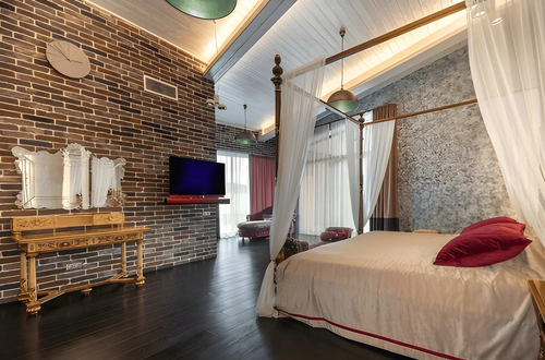
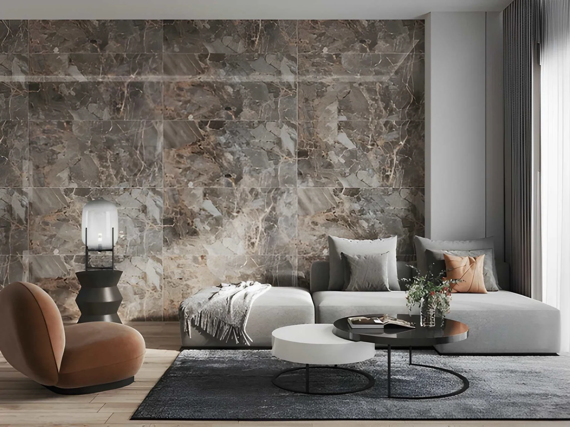
Textured walls — whether through plaster with visible brush or trowel marks, limewash paint that creates tonal variation, grasscloth wallpaper, or board-and-batten millwork — add the dimensional quality to the room’s largest vertical surfaces that painted drywall can’t achieve. A room with textured plaster walls and smooth furniture reads as more sophisticated than the same room with smooth painted walls and the same furniture, because the textural base layer is doing visual work that the furniture doesn’t have to compensate for.
| Wall Texture Type | Visual Effect | Cost Range | DIY Feasible? |
|---|---|---|---|
| Standard painted drywall | Flat — no textural contribution | Baseline | Yes |
| Limewash paint | Tonal variation — organic, aged quality | $30–$80/gallon | Yes |
| Venetian plaster (DIY) | Smooth but dimensional depth | $40–$100/gallon | With practice |
| Grasscloth wallpaper | Natural fiber texture — warm, tactile | $5–$15/sq ft | Yes |
| Board and batten | Geometric texture — architectural quality | $200–$800/wall | Moderate |
| Microcement | Contemporary flat texture — subtle | $15–$40/sq ft | Professional |
| Limewash brick effect | Historical, organic | $50–$120/gallon | Yes |
The Mid-Layer Textures: Upholstery and Soft Furnishings
The upholstery on seating, the fabrics on beds, and the soft furnishings throughout a room constitute the most variable textural layer — the one most easily changed and the one with the highest surface-to-investment ratio for textural improvement.
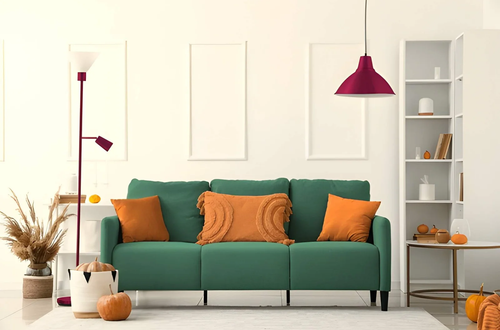
The most significant textural contrasts come from pairing materials with different tactile qualities: smooth leather against knit throw, crisp linen cushion against velvet upholstery, woven jute rug under a glass coffee table. Each pairing creates the contrast that makes both materials read more clearly than they would in isolation.
The bouclé and velvet moment: both of these fabric types are experiencing significant US residential popularity precisely because their textural qualities are so immediately apparent. Bouclé — the looped, nubby fabric associated with Chanel and now appearing extensively in US furniture — catches light in a way that flatweave fabrics don’t, creating constant low-level textural animation that makes a sofa or chair look alive rather than static. Velvet creates depth and shifts tone with directional light — the same velvet surface looks two or three different shades depending on angle.
The Detail Textures: Objects and Accessories
The final textural layer is the one most homeowners address first — decorative objects and accessories — but it’s the layer that produces the least impact when it’s the only textural layer working.
Handmade ceramics, woven baskets, rough stone objects, carved wood pieces, and organic forms like driftwood or coral all introduce specific textural qualities to surfaces that would otherwise be occupied by smooth, manufactured objects. The distinction isn’t whether the objects are beautiful — it’s whether they’re adding textural variation to the room’s existing surface vocabulary.
How to Layer Textures Correctly by Room
Living Room Texture Layering
The living room has the most surfaces and the most opportunity for textural layering. The correct sequence: establish the floor texture first (wood or natural fiber rug on hard flooring), add wall texture second (paint effect, wallpaper, or millwork on at least one primary wall), then layer soft furnishings (upholstered seating in different fabric types), and finish with objects that add tactile variation.
| Layer | Material | Textural Quality |
|---|---|---|
| Floor | Wide-plank wood + natural fiber rug | Grain + weave — two distinct textures |
| Primary wall | Limewash paint or grasscloth | Organic variation — soft visual interest |
| Seating | Linen sofa + velvet accent chair | Smooth weave + directional pile contrast |
| Cushions | Bouclé + woven cotton | Loop texture + flat weave contrast |
| Throw | Chunky knit | Maximum texture — highly tactile |
| Objects | Ceramic + stone + woven basket | Smooth glaze + rough stone + woven structure |
Bedroom Texture Layering
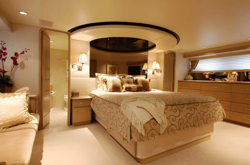
Bedrooms benefit most from textures that emphasize tactile comfort — materials that look soft and warm as well as feeling it. The bed is the room’s primary textural surface, and layering materials on it produces the most significant visual impact.
The hotel-bed approach: multiple layers in different textures — crisp cotton sheets beneath a linen duvet cover, a heavier woven blanket folded at the foot, decorative pillows in varying fabrics. The visual depth this creates makes the bed look more designed than any single, matched set achieves.
Common Texture Mistakes That Undermine Visual Interest
| Mistake | What It Produces | Better Approach |
|---|---|---|
| All smooth surfaces | Flat, clinical, cold | Add one rough or woven element per surface zone |
| All rough textures | Visually heavy, overwhelming | Balance rough with smooth and matte |
| Texture without color coherence | Visual noise — texture competes with color | Keep palette tight when texture variety is high |
| Small-scale texture in large room | Detail lost at room scale | Scale texture to room — large rooms need bold texture |
| Texture only in accessories | Insufficient depth from small elements alone | Texture must appear in large surfaces to anchor the room |
| All same fiber type | Monotonous even if textured | Mix natural (wool, linen, jute) with synthetic (velvet) |
Frequently Asked Questions
Why does a room feel flat even with good furniture and nice colors?
Almost always because textures haven’t been addressed. Color and form create the room’s visual structure; textures create its visual richness. A room with perfect color and scale but all smooth surfaces reads as flat because the eye processes each surface in one assessment and finds no reason to continue looking. Add textures and the same surfaces reward sustained attention — which is what “richness” feels like in a room.
What’s the most impactful single texture addition for a typical US living room?
A natural fiber rug (jute, sisal, or wool) under the seating group. It adds significant floor texture, defines the zone, creates acoustic softness, and introduces an organic material quality that manufactured rugs don’t provide in the same way. Combined with one textured cushion and a chunky knit throw on the sofa, these three additions produce more textural transformation than any other combination at comparable cost.
Can too many textures make a room look chaotic?
Yes — when textures are combined without a unifying color palette or material logic. The rule: keep the color palette tight when the textural variety is high. A room with five different textures in two or three related neutral tones reads as rich and layered. The same five textures in five different colors reads as chaotic. Textures create complexity; color coherence creates order. Both are needed simultaneously.
Do textures make a room feel warmer?
Yes — through two mechanisms. Textured surfaces (linen, wool, rough plaster) absorb and diffuse light rather than reflecting it, which produces the warm, non-glare quality associated with comfortable spaces. And tactile suggestion — seeing materials that look soft and warm triggers an anticipatory physical response even before touching them, which affects how the room feels emotionally as well as visually.
What textures work best in a small room without making it feel smaller?
Fine textures at small scale: linen rather than chunky knit, smooth grasscloth rather than heavy board-and-batten, tight-weave rugs rather than high-pile shag. Small rooms can carry significant textural variety — they just need textures whose individual scale matches the room’s size. The same texture that reads beautifully in a large room can feel overwhelming in a small one if the individual textural unit (the weave, the knit loop, the plaster mark) is too large for the surface.
The Bottom Line
Textures are the design variable that makes rooms feel alive rather than flat — that gives the eye continuous visual information to explore rather than a single assessment and nothing further to discover. The rooms that feel rich, warm, and genuinely dimensional are almost always rooms where textures have been deliberately layered across multiple surface types, from the floor through the walls to the upholstery and the objects.
The layering logic is consistent: establish textural ground at the floor and wall level, add contrast through upholstery and soft furnishings, finish with object-scale textures that add variation to the detail layer. Keep the color palette controlled as the textural variety increases. And resist the instinct to add more objects — textural richness comes from layering across surface types, not from accumulating more things at the object scale.
Must visit https://decoratoradvice.ca/ for visual interest textures.