Most color advice sounds confident until you actually stand in a paint store holding seventeen swatches that all look identical in the strip but nothing like the wall. The truth is, color in modern home decoration is less about picking a trendy shade and more about understanding how colors behave in your specific space — your light, your furniture, your room proportions.
Modern interiors have a distinct visual logic: clean lines, intentional contrast, and a restrained palette that lets materials do the talking. Get the color wrong and even a well-furnished room feels unsettled. Get it right and the whole space clicks into place without much effort. The difference between a room that works and one that doesn’t often comes down to three choices: base tone, depth, and accent.
This guide covers which color families hold up in modern homes, how to combine them without overcomplicating things, and which rooms call for which approach — so you leave with a clear plan, not just a mood board full of pretty pictures.
The Color Logic Behind Modern Home Decoration
Modern design does not mean white walls and nothing else. What it actually means is a tight, intentional palette — usually two or three colors — applied with clear roles: one for backgrounds, one for depth, one for accent.
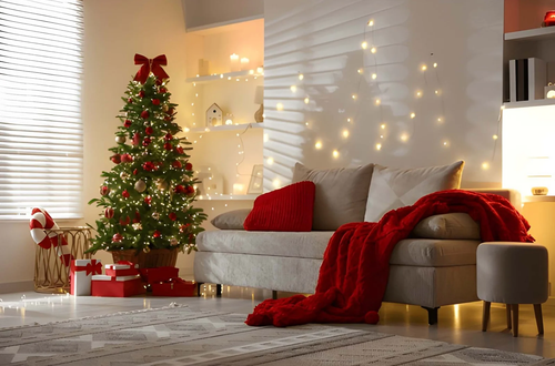
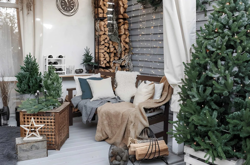
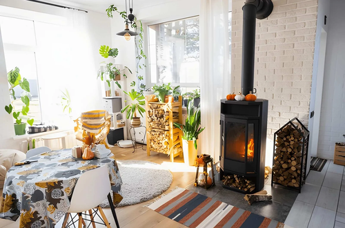
Warm neutrals are the backbone. Soft whites with warm undertones, greige (the gray-beige hybrid that dominated the last decade), and light clay tones give rooms a calm, livable quality that pairs naturally with the wood, concrete, and brushed metal that define modern interiors.
The second layer is depth: one darker tone — charcoal on a fireplace wall, deep olive on cabinetry, navy on a built-in — adds visual weight without turning the room dark. One surface, not four walls.
The third layer is accent. Rust, terracotta, sage, dusty blue. These work through repetition: the same accent in a throw pillow, a ceramic vase, and one plant pot reads as intentional. One isolated pop reads as an accident.
Best Color Palettes for Modern Home Decoration by Room
| Room | Recommended Colors | What to Avoid | Why It Works |
|---|---|---|---|
| Living Room | Warm white, greige, soft sage | Cool bright white, saturated primary colors | Creates calm base for varied furniture and lighting |
| Kitchen | Off-white, warm gray, deep forest green (cabinets) | Stark white on all surfaces, glossy bright tones | Warmth reads as livable; dark cabinets anchor the space |
| Bedroom | Muted taupe, dusty blue, warm linen | Energetic oranges, bright yellows, stark contrast | Lower saturation supports sleep and relaxation |
| Bathroom | Soft white, warm stone, pale terracotta | Heavy dark tones without natural light | Light tones expand tight spaces; warmth avoids clinical feel |
| Home Office | Warm white, light green, light gray | Aggressive red or orange, overly dark walls | Supports focus without visual fatigue over long hours |
Color Combinations That Actually Work in Modern Spaces
Certain pairings show up repeatedly in well-executed modern homes because they solve a real problem: they create visual interest without visual noise.
| Color Combination | Mood / Effect | Best Used In |
|---|---|---|
| Warm white + walnut wood + black hardware | Clean, grounded, timeless | Living rooms, kitchens |
| Greige + sage green + brushed brass | Organic, warm, calm | Bedrooms, dining areas |
| Charcoal + off-white + natural linen | Sophisticated, understated contrast | Home offices, living rooms |
| Clay + terracotta + cream | Earthy, warm, current | Kitchens, entryways |
| Deep navy + warm white + light oak | Bold but anchored | Accent walls, built-ins |
These are starting points, not rules. Warm white, walnut, and black hardware work because the three elements contrast enough to define each other without competing. That logic applies to any palette you build.
What Colors to Actually Avoid in Modern Home Decoration
A few things that routinely hurt modern interiors:
- Cool, bluish whites. Sterile under incandescent light and clash with warm wood tones.
- Matching everything to the wall color. A room where sofa, rug, and curtains all pull from the same tone goes flat. You need at least one contrasting value.
- Too many accent colors. Three is the ceiling — more than that and the eye has nowhere to rest.
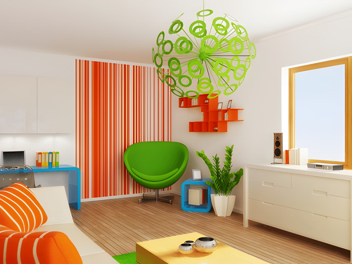
- Saturated color on all four walls. One bold wall is a design choice. Four bold walls in a small room is a commitment most people regret.
Quick rule: If you can describe your room’s palette in one sentence, it’s working. If you need three sentences to explain the “concept,” it’s probably too much.
Frequently Asked Questions About Colors in Modern Home Decoration
What is the best color for modern home decoration?
Warm white, greige, and soft sage are the most reliable options. They work across lighting conditions, pair with wood and metal, and stay relevant. If you need one go-to: warm white with yellow or beige undertones, never blue undertones.
Should modern homes use dark or light colors?
Both — but with structure. Light tones on large surfaces, dark tones as anchors on one wall, cabinets, or trim. Reversing that ratio makes rooms feel heavy, especially with limited natural light.
What colors make a small room look bigger?
Light neutrals. Keep walls, trim, and ceiling in the same tonal family — removing visual breaks makes the space feel continuous. Soft warm white throughout reads larger than white walls paired with bright white trim.
Is beige still in style for modern interiors?
Warm beige variants — greige, sand, clay — are firmly current. The flat, cold beige of the 1990s is what feels dated. Earthy warm tones are among the strongest choices in modern home decoration right now, especially in living rooms and bedrooms.
Final Thoughts on Colors for Modern Home Decoration
The color logic behind modern home decoration isn’t complicated once you see it clearly: warm neutrals as your base, one deeper tone for visual weight, one accent that shows up in small repeated doses. That structure covers most rooms, most budgets, and most lighting conditions.
The one step most people skip is living with a swatch for a few days before committing. Paint looks different at 9 AM than at 7 PM, and different under artificial light than under natural light. That’s the step that separates good choices from expensive regrets. Start with the room you use most — get that right and the rest of the house follows naturally.
For more home decorations visit https://decoratoradvice.ca/