There’s a particular kind of room that stops you when you walk in. Nothing is obviously flashy. Nothing screams money. But the whole thing feels considered, layered, and quietly expensive. What’s actually happening in that room is rarely about the price of individual pieces — it’s about the decorative elements chosen, how they’re combined, and what’s been deliberately left out.
Making a plain room look expensive is one of the most searched decorating questions online, and most answers miss the point. They focus on budget hacks and dupe products when the real answer is simpler: expensive-looking rooms share specific visual characteristics that have nothing to do with actual cost. Proportion. Texture contrast. Restraint. The right finish in the right place. These are learnable, repeatable, and available at almost any price point.
This guide covers the decorative elements that consistently make plain rooms look expensive — what they are, why they work, which ones to prioritize, and what most people get wrong when they try to elevate a space on a budget. No full renovation. No designer fees. Just the specific choices that do the most work.
What Makes a Room Look Expensive? The Core Principles
Before specific elements, it helps to understand what “expensive” actually signals visually. Rooms that read as expensive share a handful of consistent characteristics regardless of what was actually spent.
| Visual Signal | What It Communicates | How to Achieve It |
|---|---|---|
| Proportion and scale | Intentionality, spatial confidence | Right-sized furniture, proper rug sizing |
| Texture contrast | Depth, richness, material quality | Mix matte, sheen, rough, and soft surfaces |
| Restraint | Curation over accumulation | Edit down to fewer, better objects |
| Color cohesion | Deliberate design thinking | 2-3 color palette, consistent undertones |
| Quality finishes | Craft and durability | Prioritize visible hardware and trims |
| Negative space | Confidence, breathing room | Leave surfaces intentionally empty |
Decorative Elements That Make a Plain Room Look Expensive
1. Crown Molding and Architectural Detail
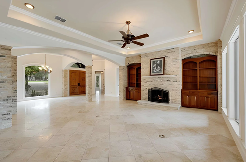
Nothing reads as expensive faster than architectural detail — and crown molding is the most accessible version of it. A plain room with flat walls and no transition between wall and ceiling looks unfinished by comparison to the same room with even simple molding added.
You don’t need elaborate profiles. A clean, modest crown molding — even a painted MDF version — adds the kind of visual weight that makes a room feel built rather than assembled. Chair rails, picture rails, and board-and-batten paneling work on the same principle: they signal that someone thought carefully about the room’s structure, not just its contents.
2. Large-Format, Properly Sized Rugs
Undersized rugs are one of the most reliable signals of an unpolished room. A rug that only fits under the coffee table while the sofa legs float on bare floor looks like an afterthought — because it is one. In a living room, the rug should be large enough for at least the front legs of every seating piece to sit on it. In a dining room, it should extend at least 24 inches beyond the table on all sides.
A large, properly placed rug grounds the furniture arrangement, defines the space, and adds the kind of considered proportion that expensive rooms always have. The material matters less than the size and placement.
3. Upgraded Hardware and Fixtures
Switching out builder-grade hardware — door handles, cabinet pulls, light switch plates, curtain rods — is one of the highest-return decorative investments available. These are the details that get touched every day and noticed subconsciously even when no one is consciously registering them.
Brass, brushed nickel, and matte black consistently read as more premium than chrome or plastic. The finish doesn’t need to be uniform throughout the room, but it should be coherent — mixing brushed brass and polished gold in the same space creates visual conflict that cancels out the quality signal of either.
4. Curtains Hung High and Wide
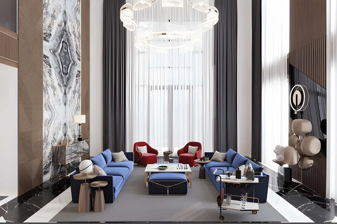
Most curtains are hung wrong. Standard installation — curtain rod just above the window frame, panels barely wider than the window — makes windows look small and ceilings look low. The expensive-looking approach is to hang the rod as close to the ceiling as possible and extend it 6–12 inches beyond the window frame on each side.
This makes windows look larger, ceilings look taller, and the whole room feel more considered. The curtain panels themselves don’t need to be expensive — the hang does most of the work. Floor-length panels that just graze or slightly pool on the floor reinforce the effect.
5. Texture Contrast Across Surfaces
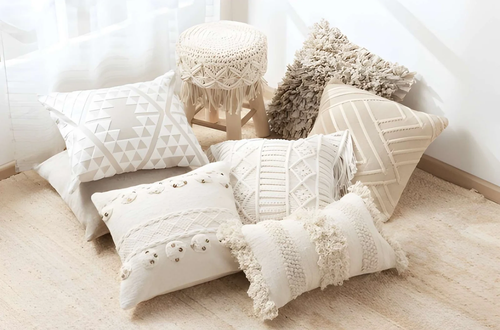
Rooms that read as flat and cheap usually have one consistent surface quality — everything is smooth, or everything is matte, or everything is the same visual weight. Rooms that feel expensive have contrast: a matte linen sofa next to a sheen-finish throw pillow, a rough stone object on a polished tray, a nubby wool rug under a smooth wood coffee table.
Texture contrast creates the visual richness that most people attribute to expensive materials when it’s actually just variety. You can achieve it at almost any price point by being deliberate about mixing finishes and material types rather than matching everything.
6. Intentional, Edited Art Placement
A large single piece of art hung at the correct height reads as expensive. A collection of small mismatched frames hung randomly reads as accumulated. The expensive-looking approach is fewer, larger pieces, hung so the center sits at roughly eye level (57–60 inches from the floor to center), with enough wall space around them to breathe.
Gallery walls can work — but they require a consistent frame finish, a clear organizing logic, and enough scale to hold the wall. When in doubt, one large piece outperforms twelve small ones in terms of perceived value.
7. Considered Lighting Fixtures
A builder-grade flush-mount ceiling fixture is the fastest way to signal that a room hasn’t been thought about. Replacing it with a pendant, semi-flush, or chandelier scaled to the room costs less than most people assume and changes the entire perceived quality of the space.
The fixture is visible whether the light is on or off — it’s a decorative object first and a light source second. The right lighting fixture for your room adds architectural presence and design intentionality that no amount of accessory styling can compensate for when it’s missing.
Priority Order: Where to Spend First
| Decorative Element | Expense Impact | Typical Cost Range |
|---|---|---|
| Curtain height and width | Very High | Low (rehang existing) |
| Rug size correction | Very High | Medium |
| Hardware upgrades | High | Low to Medium |
| Crown molding | High | Low to Medium |
| Art scale and placement | High | Variable |
| Texture contrast (textiles) | Medium-High | Low |
| Lighting fixture upgrade | Medium-High | Medium |
| Negative space editing | Medium-High | Free |
FAQ
What single change makes a room look most expensive?
Curtain placement. Hanging curtains from ceiling height and extending the rod well beyond the window frame costs nothing if you already have the curtains — it’s just repositioning. The visual impact on ceiling height and window scale is immediate and significant.
Do expensive-looking rooms require expensive furniture?
No. The visual signals of an expensive room — proportion, texture contrast, restraint, architectural detail — are largely independent of furniture price. A well-placed, right-sized sofa from a mid-range retailer in the right fabric reads better than an expensive sofa that’s the wrong scale or poorly positioned.
How many decorative objects should be on a surface?
Three is the practical maximum for most surfaces, and one or two is often better. The expensive-looking approach is to give each object space to be noticed individually rather than competing with neighbors for attention.
Does paint color affect how expensive a room looks?
Yes. Flat or eggshell paint in a muted, warm-toned color reads as more deliberate than bright or highly saturated colors. Painting walls and ceiling the same color (or ceiling slightly lighter) removes visual breaks that make rooms feel choppy and unresolved.
Can plants make a room look more expensive?
One large, healthy plant in the right spot — a fiddle-leaf fig, olive tree, or large monstera — adds organic scale and visual weight that no decorative object fully replicates. Multiple small plants scattered around tend to create clutter rather than richness. Scale and placement matter more than species.
Bottom Line
Making a plain room look expensive isn’t about buying expensive things. It’s about understanding which decorative elements carry the most visual weight and prioritizing those over accumulating more stuff. Crown molding, properly sized rugs, upgraded hardware, high-hung curtains, texture contrast, edited art, and considered lighting fixtures — these are the specific moves that shift how a room is perceived.
Most of them are about correction and restraint rather than addition. The rooms that consistently read as expensive are the ones where someone made deliberate choices and then stopped. Less, chosen well, in the right proportions, with the right finishes. That’s the entire formula. The budget is almost beside the point.
Must visit https://decoratoradvice.ca/ for decorative elements to make a palin room expensive.