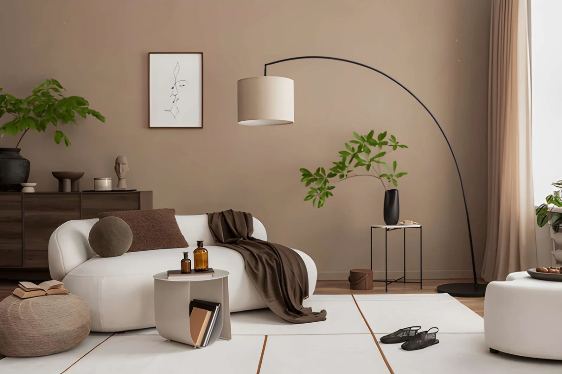
Two rooms can hold the same sofa, the same rug and the same plant, and only one of them earns a second look. The difference is rarely the shopping list. A perfectly styled space stands out because every object seems to know why it’s there. The eye travels easily, surfaces have room to breathe, and nothing fights for attention. Styling is the last layer of design, and it’s where many well-furnished homes fall flat. Stylists work from a short set of principles: a clear focal point, varied height, repeated colour, mixed texture and edited surfaces. This article explains what makes a perfectly styled space stand out, how to apply each principle on a modest budget, and which mistakes quietly ruin the effect. You’ll find two reference tables, a five-minute styling routine and a short FAQ built around the questions people actually search. Treat it as a checklist for the next time a room feels almost right but not quite.
What Makes a Perfectly Styled Space Stand Out?
A perfectly styled space stands out because it has one clear focal point, objects at varied heights, repeated colours, mixed textures and plenty of empty space. These choices guide the eye in a calm path instead of scattering attention across clutter.
| Principle | What it does | Easy way to apply it |
|---|---|---|
| Focal point | Gives the eye a place to start | One large artwork or statement lamp |
| Varied height | Creates rhythm | Mix tall, medium and low objects |
| Repetition | Ties the room together | Repeat one colour at least three times |
| Texture | Adds depth | Pair smooth with rough and matt with shine |
| Negative space | Lets pieces breathe | Leave a third of each surface empty |
| Odd groupings | Feels natural | Cluster in threes or fives |
How Do Focal Points and Height Guide the Eye?
Every styled surface needs a “leader”. On a console table, that might be a tall lamp. On a shelf, a large piece of art leaning at the back. Once the leader is placed, add a medium object and a small one in front, which forms a loose triangle. Triangles feel balanced because the eye moves up, across and down without stopping.
Height does the same job at room scale. If everything sits at sofa level, the room looks flat. Add something tall (a floor lamp, a tall plant, curtains hung near the ceiling) and something low (a stack of books, a bowl). Art is easiest to judge: galleries commonly centre pieces about 57 inches (145 cm) from the floor, and homes often hang them too high.
Why Do Texture and Repetition Make a Perfectly Styled Space Feel Finished?
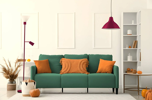
Colour tells people the room is intentional, and texture tells them it’s real. Choose a palette of two or three colours and repeat each at least three times in different places, such as a rust cushion, a rust vase and a rust stripe in the rug. This repetition is what designers mean when they say a room is “pulled together”. For lighting fixtures that support the same palette, your anchor text is a sensible next step.
Then vary the surfaces. A room full of smooth, matt objects looks like a catalogue page. Add contrast and it comes alive.
| Combine this | With this | Result |
|---|---|---|
| Smooth ceramic | Nubby wool | Warm contrast |
| Matt paint | Aged brass | Quiet richness |
| Polished stone | Raw timber | Natural balance |
| Crisp linen | Soft velvet | Layered comfort |
How Much Should You Leave Empty?
More than most people expect. A perfectly styled space is mostly edit. On a bookshelf, many stylists fill roughly two thirds of the space and leave gaps, because empty areas make the objects you do show look chosen. On a coffee table, one tray, one book stack and one small plant is plenty. If your hand slides across a surface without moving anything, the surface is too full.
What Mistakes Stop a Space From Standing Out?
| Mistake | Why it hurts | Fix |
|---|---|---|
| Everything the same height | Looks flat | Add one tall element |
| Items in pairs and rows | Feels stiff | Use odd numbers, vary spacing |
| Too many small objects | Reads as clutter | Swap for fewer, larger pieces |
| Random colours | Feels unplanned | Limit palette, repeat colours |
| Furniture pushed to walls | Feels like a waiting room | Float pieces slightly forward |
A Five-Minute Styling Routine
- Clear the surface completely.
- Place the tallest object first.
- Add a medium object at a different depth.
- Add one small, textured item in front.
- Step back, squint, and remove one thing.
Frequently Asked Questions
How do you style a room so it looks professional?
Pick one focal point, repeat your main colours three times, mix textures, and remove anything that doesn’t earn its place. Professional rooms look edited, not decorated.
How many objects should be on a coffee table?
Usually three to five. A tray, a book stack and one living element such as a plant is a reliable start.
Does styling cost a lot?
No. Rearranging what you own, editing surfaces and adding one large piece of art or a lamp often changes a room more than a new sofa.
How often should I restyle?
Seasonal swaps (cushions, flowers, throws) keep things fresh. Leave the main structure alone.
Final Thoughts
A perfectly styled space is not the one with the most beautiful objects. It’s the one where each object has a job, the colours repeat, the textures argue gently and the empty areas are left empty on purpose. Start with one surface, apply the five-minute routine, and judge it from the doorway.
Must visit https://decoratoradvice.ca/ for perfectly styled space ideas.