Graphic design and interior design may work on different surfaces, but they solve many of the same visual problems. Both disciplines organize space, guide attention, create mood, and balance practical needs with aesthetics. For graphic designers, studying how interior designers work can offer useful lessons that go beyond choosing colours or following trends. These ideas can improve layouts, branding, digital graphics, and banner design by making each element feel purposeful rather than simply decorative.
How Does Interior Design Teach Better Use of Space?
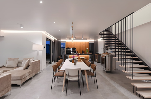
Interior designers rarely think of empty space as wasted space. An open area around a sofa, table, or doorway helps people move through a room and makes important features easier to notice. Graphic designers can use the same principle.
In graphic design, this open area is usually called negative space or white space. It is the unused space around text, images, buttons, logos, and other visual elements. White space does not need to be white. It can be any colour, texture, or background that gives nearby elements room to breathe.
A common design mistake is trying to fill every available area. A room packed with furniture can feel cramped. In the same way, a graphic filled with headlines, icons, images, shapes, and calls to action becomes difficult to understand. Removing unnecessary elements can often make a design stronger.
This lesson matters when working with banners, posters, social graphics, and website headers. A viewer may only give the design a few seconds of attention. Clear spacing helps them identify the main message quickly.
Key takeaway: Treat empty space as an active design element. Space improves clarity, creates emphasis, and gives important content room to stand out.
What Can Graphic Designers Learn From Focal Points?
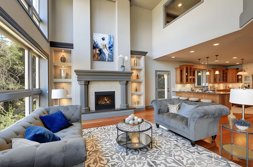
Walk into a well-designed living room and your attention will often move toward one dominant feature. It might be a fireplace, a large window, a piece of art, or an unusual light fixture. Interior designers call this a focal point, meaning the element intended to attract attention first.
Graphic designers need focal points too. If every element has the same visual strength, viewers have no obvious place to begin. A strong headline, photograph, illustration, number, or call to action can establish the starting point.
The next task is creating visual hierarchy, which is the order in which viewers notice and process information. Size is one way to build hierarchy, but it is not the only one. Colour, contrast, position, typography, shape, and surrounding space can all influence attention.
For example, an effective promotional banner might use:
- A large headline as the primary focal point.
- A supporting image to provide context.
- A short line of explanatory text.
- A clearly visible call to action.
- A logo or brand identifier in a supporting position.
This approach gives viewers a path through the information instead of asking them to process everything at once.
Key takeaway: Every composition needs a clear starting point. Choose the most important message first, then use visual hierarchy to guide the viewer through everything else.
How Can Interior Design Improve Colour Decisions?
Interior designers often build colour schemes around relationships rather than isolated shades. A wall colour needs to work with flooring, furniture, natural light, fabrics, and architectural details. Graphic designers benefit from the same contextual thinking.
Colour should support the purpose of a design. A bright accent may attract attention, while a neutral background can reduce visual competition. Designers should also consider contrast because attractive colour combinations are not automatically readable ones.
The Web Content Accessibility Guidelines from W3C provide useful guidance on colour contrast for digital content. These standards are especially relevant when graphics include text that people need to read quickly.
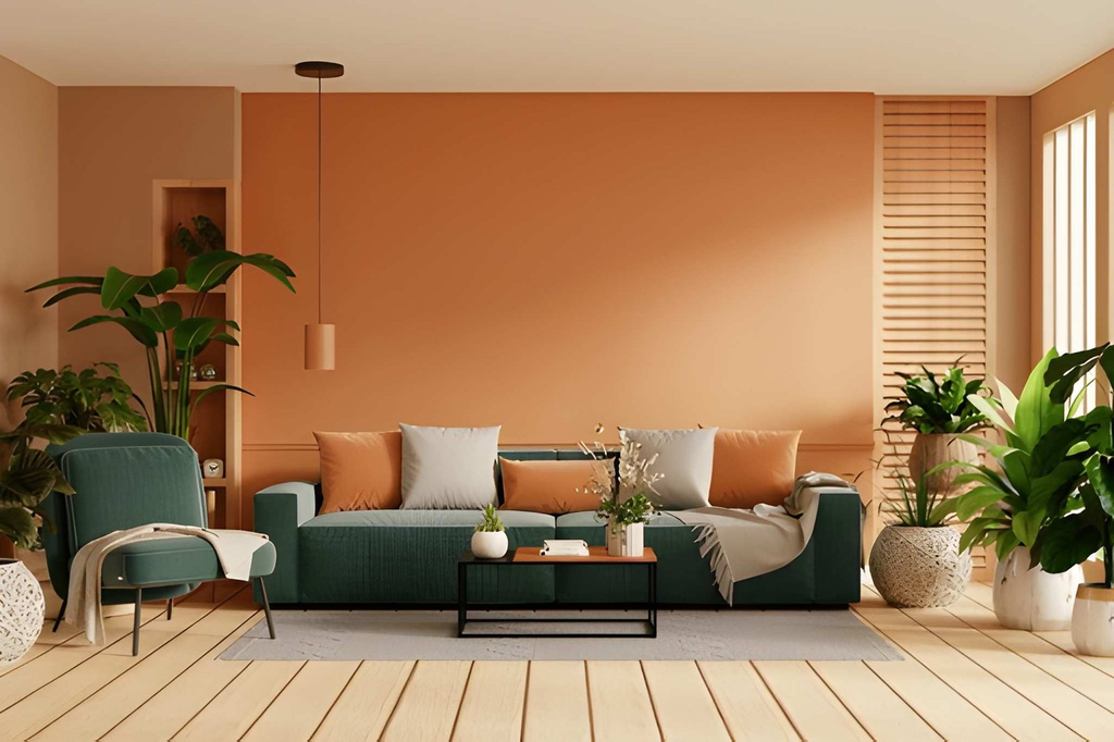
A practical approach is to build a simple palette with a dominant colour, one or two supporting colours, and an accent. This resembles an interior where walls establish the base, furniture provides secondary tones, and smaller decorative objects introduce stronger accents.
Designers can apply the same thinking to room-inspired colour palettes. A warm neutral background might carry most of the composition, while a dark text colour provides contrast and a richer accent highlights the action users should take.
For more inspiration on how colour, materials, furniture, and decorative choices work together in real spaces, readers can explore the home decorating ideas on DecoratorAdvice.
Key takeaway: Choose colours as a system, not as separate favourites. Give each colour a job and make readability more important than novelty.
Why Should Graphic Designers Think About Balance Like Interior Designers?
Interior designers distribute visual weight throughout a room. Putting every large piece of furniture on one side can make the space feel unbalanced, even when everything technically fits.
Graphic layouts behave in much the same way. Large photographs, dark colours, bold typography, bright shapes, and dense groups of information all carry visual weight.
Designers can use symmetrical balance, where elements are arranged evenly around an axis, to create order and stability. Alternatively, asymmetrical balance uses different elements that still feel visually equal. A large photograph on one side, for example, might be balanced by a smaller but bold headline on the other.
Asymmetry is particularly useful in modern digital graphics because it can create energy without creating disorder. The goal is not to make both sides identical. The goal is to prevent one area from feeling unintentionally heavy.
A useful test is to shrink a design until individual words become difficult to read. Look at the composition as a group of shapes and tones. If one corner dominates without a clear reason, the layout may need adjustment.
Key takeaway: Balance does not require perfect symmetry. Distribute visual weight deliberately so the composition feels stable without becoming predictable.
What Does Interior Design Teach About Texture and Depth?
A successful interior often combines smooth walls, woven fabrics, natural wood, glass, stone, metal, and other surfaces. These materials create texture, which adds visual and physical character.
Graphic designers can create a similar effect through photographs, subtle patterns, gradients, shadows, illustrations, and layered shapes. However, texture should support the message rather than compete with it.
Consider a graphic for an article about natural interiors. A restrained paper texture or subtle wood-inspired pattern could reinforce the subject. A highly detailed background behind small text would do the opposite because it reduces readability.
Depth deserves similar restraint. Interior designers use foreground, middle ground, and background relationships naturally because rooms exist in three dimensions. Graphic designers can simulate those relationships through scale, overlap, blur, shadows, and contrast.
This does not mean every flat graphic needs a three-dimensional appearance. Instead, designers can use depth to show relationships. An overlapping shape may connect two pieces of information, while a soft background image can provide context without challenging the headline.
Key takeaway: Use texture and depth to strengthen context and hierarchy. Decorative effects should clarify the visual experience, not make it busier.
How Can Room Planning Improve Graphic Layouts?
Before decorating a room, interior designers consider how people will use it. They think about entrances, walking routes, seating, storage, sightlines, and the relationship between different activity zones.
Graphic designers can borrow this idea by considering the viewer’s journey through a layout.
Imagine a page as a room. The headline is the entrance. Supporting information provides direction. Images create points of interest. A button or link represents the destination. If these pieces appear in a confusing order, the viewer has to work harder to understand what to do.
This is especially useful for banner design, where space is limited. Before adding decoration, a designer can ask:
- What should viewers notice first?
- What information do they need second?
- Which element provides context?
- What action should they take?
- Which elements can be removed without losing meaning?
Creating this information path before choosing decorative details can prevent clutter and renovation communication.
Key takeaway: Plan layouts around the viewer’s journey. Decide how attention should move through the design before polishing its appearance.
What Can Graphic Designers Learn From Repetition in Interiors?
Interior designers often repeat materials, colours, shapes, and finishes to make separate parts of a home feel connected. A wood tone may appear in the dining table, shelves, and picture frames. A curved shape might repeat in a mirror, chair, and light fixture.
Graphic designers use repetition for the same reason. Repeated typography, colours, icon styles, spacing rules, border treatments, and shapes establish consistency.
This principle is particularly important when producing a family of assets. A website graphic, newsletter header, social post, and advertisement do not need identical layouts, but they should feel as if they belong to the same visual system.
Repetition also reduces the number of decisions a viewer needs to interpret. When the same button style always indicates an action, or the same type treatment always marks a heading, people can understand the design more quickly.
Consistency should not become monotony, however. Interior designers introduce variation within a coherent scheme. Graphic designers can do the same by varying photography, composition, or scale while keeping core brand elements stable.
Key takeaway: Repeat key visual elements to build recognition and coherence, then use controlled variation to keep the work interesting.
Why Does Function Need to Come Before Decoration?
A beautiful chair that is uncomfortable has failed at one of its main jobs. Likewise, an impressive kitchen that makes everyday tasks difficult is not fully successful. Interior design constantly demonstrates the relationship between form and function.
Graphic design follows the same rule. A beautiful layout fails if viewers cannot read the text, understand the message, or find the next action.
This principle offers a useful way to evaluate work. Instead of asking only, “Does this look good?” ask:
- Can someone understand it quickly?
- Is the most important information obvious?
- Is the text easy to read?
- Does the visual style match the subject?
- Are decorative elements helping communication?
- Does the design still work at its intended size?
For banners in particular, reducing the number of competing elements is often more useful than adding another visual effect. The goal is not maximum decoration. It is maximum clarity within an appropriate visual style.
Key takeaway: A successful design solves its communication problem first. Decoration should strengthen function rather than compensate for weak structure.
How Can Graphic Designers Use an Interior Designer’s Process?
Interior designers usually do not begin by buying random furniture and hoping everything works together. They define requirements, measure the space, establish a direction, select key elements, and refine details.
Graphic designers can adopt a similar workflow:
- Define the purpose. Identify the message, audience, format, and required action.
- Measure the space. Confirm dimensions and understand where the finished graphic will appear.
- Create hierarchy. Decide which information needs the greatest emphasis.
- Set a visual direction. Establish typography, colour, imagery, and overall mood.
- Build the structure. Place major elements before adding smaller details.
- Add supporting elements. Introduce texture, icons, patterns, or decorative shapes only when useful.
- Review from a distance. Check whether the main idea remains obvious at a glance.
- Remove unnecessary details. Simplify anything that distracts from the core message.
This process works because it separates structural decisions from decoration tips. It encourages designers to solve the main communication challenge before polishing minor details.
Key takeaway: Design from structure to detail. Establish purpose, space, hierarchy, and visual direction before spending time on decorative finishing touches.
What Is the Biggest Lesson Graphic Designers Can Take From Interior Design?
The biggest lesson is that design is about relationships. A chair cannot be judged only as an isolated object. Its size, colour, position, material, and purpose depend on the living room around it. Graphic elements work the same way.
A typeface that looks attractive on its own might not suit the image beside it. A bold colour can be effective in one composition and overwhelming in another. Even a well-designed call-to-action button can fail if nearby elements compete for attention.
Looking at the entire visual environment helps graphic designers make more coherent decisions. This mindset shifts attention away from individual effects and toward the experience created by all the elements working together.
Key takeaway: Judge design elements by how they work together. Strong compositions come from relationships between space, hierarchy, colour, texture, function, and context.
Frequently Asked Questions
What is visual hierarchy in graphic design?
Visual hierarchy is the order in which a viewer notices and understands elements in a composition. Designers create it with size, contrast, colour, position, spacing, and typography.
Takeaway: Visual hierarchy tells viewers where to look first, second, and next.
How does interior design help with banner design?
Interior design teaches designers to manage limited space, establish focal points, balance visual weight, coordinate colours, and remove unnecessary decoration. These principles help banners communicate quickly.
Takeaway: Interior design principles can make banners clearer, more balanced, and easier to scan.
Why is negative space important?
Negative space separates elements and reduces visual clutter. It can also draw attention to important content by limiting competition around it.
Takeaway: Empty space improves focus and readability rather than representing wasted space.
Should graphic designers follow interior design trends?
Trends can provide inspiration, especially for colour, texture, shape, and mood. However, designers should use them selectively and prioritize the project’s purpose, audience, and long-term visual identity.
Takeaway: Use trends as inspiration, not as substitutes for sound design principles.
What interior design principle is most useful for graphic designers?
Visual hierarchy is one of the most transferable principles because both fields need to direct attention. Space, balance, repetition, and function are equally valuable when building a complete composition.
Takeaway: Start with hierarchy, then use space, balance, colour, and repetition to support it.
Conclusion: Design the Whole Experience
Graphic design and interior design share a fundamental goal: arranging visual elements so people can understand, use, and enjoy a space. Graphic designers can learn from the way interior designers handle focal points, negative space, balance, colour, texture, repetition, and function.
The most useful lesson is to stop treating individual elements as isolated choices. Whether planning a room, a website graphic, or a banner design, every decision affects the surrounding composition. Start with function, establish hierarchy, create breathing room, and add decoration with purpose. When all the elements support one another, the final design becomes clearer, more useful, and more memorable.
Key takeaway: Borrowing interior design principles helps graphic designers create work that balances aesthetics with function. Focus on relationships, guide attention deliberately, and make every visual choice earn its place.